A Study of Velázquez' Technique Results
In Portrait Pigments for Today
Those perfect flesh tones in the portraits of
Velázquez—available for today's
artists.
(The first of three articles on this subject.)
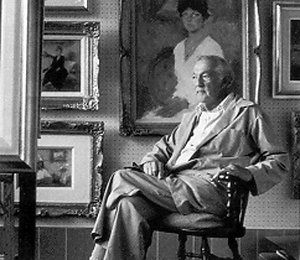
Samuel Edmund Oppenheim
(1901-1992) |
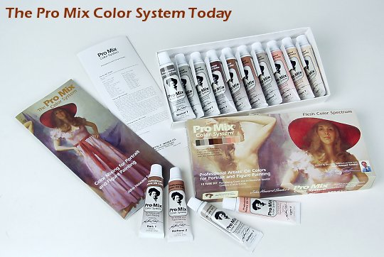
In 1974, the Manufacture
of the Velázquez/Oppenheim
Pigment Combinations Is Sponsored by the Art
Students League of New York.
 Stewart
Klonis,
Executive Director, The Art Students League
of New York, who made possible the manufacture
of the Velazquez/ Oppenheim pigment combinations,
which became known as the Pro Mix Color
System.
Stewart
Klonis,
Executive Director, The Art Students League
of New York, who made possible the manufacture
of the Velazquez/ Oppenheim pigment combinations,
which became known as the Pro Mix Color
System.
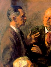
Detail
of the painting Homage to Sargent by Robert
Phillip. Collection, the Art Students
League of New York.
|
|
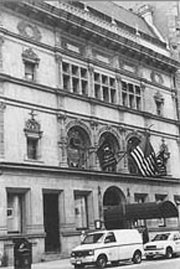
The
Art Students League,
which, in 1974, provided
financial backing for the
Pro Mix Color System.
In the 32 years since,
50,000 artists worldwide
have used the colors. |

John Howard Sanden
The Oppenheim/Velazquez
Pigment Combinations are available as The Pro
Mix Color System from The Portrait
Institute at www.portraitinstitute.com.
Additional relevant material:
Descriptions of the
Oppenheim/Velázquez Pigment Combinations
(Today's Pro Mix Color System).
Putting the Oppenheim/Velázquez
Pigment Combinations (Today's ProMix Colors)
Into Practice.
The Traditional Protocol
for All Color Mixtures.
|